He’s been described as the “founding father of African literature”, an author “who played key role in developing African literature”; a “towering man of letters” who “helped to revive African literature”… but these accolades do little justice to Chinua Achebe’s literary legacy. One of the greatest writers/storytellers in the English language, Achebe was equally adept at portraying humour and horror – a writer whose wisdom and humanity left an indelible mark on all those who read him. The international success of his first novel, Things Fall Apart is testimony to his remarkable legacy. Published in 1958, when he was only 28, the book would become a classic, selling more than 10 million copies in 45 languages. On the eve of his death, we explore Achebe’s many globe-trotting literary guises through Sean O’Toole‘s visual history of Things Fall Apart.
Rest in Peace Chinua Achebe.

Chinua Achebe’s story of Okonkwo – “a man of action, a man of war” – remains unchanged since Things Fall Apart was first published in 1958. Achebe’s debut novel offers an intimate portrait of the tragic downfall of Okonkwo, a wealthy farmer from the fictional village of Umuofia. Okonkwo has three wives and two barns full of yams. “He was still young but had won fame as the greatest wrestler in the nine villages,” writes Achebe, whose novel is set in the late 19th century, when bicycles had about them a strangeness and Nigerian tribesmen were “amused” by the “foolishness” of the white colonists and their religion.
Haunted from the outset by the “clear overtone of tragedy”, which Okonkwo first intuits in a crier’s voice one night, Achebe’s novel ends bleakly with the disgraced farmer’s suicide. Colonisation and Africa’s subjugated entry into the 20th century form an unavoidable backdrop to this novel, which offers the reader a sense of the nuance and complexity of traditional Igbo life. Things Fall Apart has been widely praised – literary critic Harold Bloom writing that it is “a splendidly traditional book, Oedipal and proverbial, and owes nothing to the Four Horsemen of Resentment: Fanon, Foucault, Derrida and Lacan”.
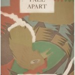
But for Bloom’s latter observations, everything I’ve offered so far by way of a reduced introduction is uncontroversial, an unchanging given of this literary classic. It is also incomplete and selective, which is a useful way of pointing to the difficulties confronting any book designer aiming to give Achebe’s celebrated work a definitive graphic look. It is probably fair to admit that few designers aim for absolute outcomes – a definitive cover for instance – their aims more practically applied toward a workable visual interpretation. Things Fall Apart, which has sold in excess of 11 million copies, is a book that has delivered its steady flow of new readers, many of them students, a perplexing assortment of visual interpretations during the last half-century.
When Heinemann, the publishing house founded by William Heinemann in 1890, first offered to publish Achebe’s book, it commissioned graphic artist C.W. Bacon to design the hardcover dust jacket. Bacon was well known for his crime fiction covers, having previously designed the Hamish Hamilton editions for Raymond Chandler’s novels The Little Sister (1949) and The Simple Art of Murder (1950). His design focused on rendering the spiritual and religious conflicts at the heart of Things Fall Apart, tensions that culminate near the end of the novel with Enoch, a fanatical Christian convert, unmasking a spiritual guide or egwugwu during a festival marking the earth deity. Bacon’s tart green cover features cartoonish men in masks in the foreground – they stand behind two banana fronds – with a church shown in the background.
The first US edition of Things Fall Apart, published in 1959 by McDowell, Obolensky, also concentrates on the mask, a lazy visual shorthand for Africa, but offers a far more modernist interpretation. Type dominates the orange, black and white dust cover, with the title set in a clean san-serif font rendered in upper case. The design is in many ways a hard bop masterpiece and recalls the way designer Reid Miles at Blue Note used hot orange to render the sleeve art for albums by Milt Jackson, Thelonious Monk and Kenny Dorham. This visual treatment was later transposed to the first US soft-cover edition.
The international success of Things Fall Apart was never anticipated. Early on it prompted Alan Hill, an editor at Heinemann, to develop the African Writers Series, with a softcover version of Things Fall Apart launching the new imprint. Also rendered in orange, black and white, the cover design was stoically British and featured drawings of a mask, piece of leafy flora and carved drum surrounded by pseudo-modernist bands of colour.
This Penguinesque treatment differed greatly from the photographic interpretation given the novel by Cape Town photographer George Hallett a decade later. Born in 1942, 12 years after Achebe, Hallett was in his late 20s – about 26 or 27, he isn’t exactly sure – when he arrived in London. “I went in self-imposed exile because it was just awful to find work in South Africa,” he told me. “When I went to London the first thing that happened was I met South African exiles … mostly musicians – Chris McGregor, Louis Moholo, Dudu Pukwana, Johnny Dyani …” he trails off a list of names associated with The Blue Notes and Brotherhood of Breath.
Hallett soon found work as a freelancer photographer and was commissioned to create book covers by Heinemann Educational Books, which published the African Writer Series, of which Achebe was editor. For a short period, photography was integral to the graphic packaging of books by this imprint, which published writers as diverse as Can Themba, Wole Soyinka and Ayi Kwei Armah. Hallett was given a lot of room to play.
“We used photographic covers with South African models,” he recalls, “mostly because I knew them and they were easily accessible. In London you could find anything in terms of props. I created theatre, I used the streets of London or bedrooms, and I never used professional studios. I created an ambience using costumes and my imagination. I got people to perform the theme out of the book that I felt reflected what was going on in the book and which made the potential purchaser look at the book. They had to be dramatic and interesting and different from everything else.”
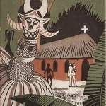
Hallett’s striking cover for the 1968 edition of Things Fall Apart certainly is this. A colour photograph is floated on an orange background; it shows future South African minister of arts and culture Pallo Jordan enacting Okonkwo’s rage against the colonial religion that leads him to kill two court messengers sent to order the break-up of a village meeting. The design includes a minimum of text, just the author’s name and the title of the book, the word “apart” rendered in a vibrating type that underscores Okonkwo’s rage.


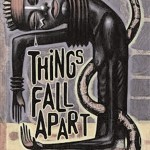


Various designs over the years have attempted to visualise Okonkwo – a 2001 Penguin Modern Classics edition representing him photographically as an elderly, sombre man, his eyes downcast. This year Edel Rodriguez got closer to Okonkwo by abstracting him – Rodriguez’s 50th anniversary design featuring an upturned head, fleetingly rendered in black ink and balanced on an orange block of colour containing the book’s vital information. Gradually, though, as Achebe’s acclaim has surpassed his most famous character (who ate “with kings and elders”), the author has become the subject of various cover designs. There is a predictable literalism at work in these covers: black man = Africa = book about Africa. Not all the covers have been this reductive. The 1985 edition of the Fawcett Crest edition is rendered in the style of Lemi Ghariokwu’s album covers for Fela Kuti and shows a fractured map of Africa. A 1999 hardcover edition from publishers Holt, Rinehart and Winston offers a comic book rendering of a vaguely tribal figure, a snake (a dangerous animal “never called by its name at night”, Achebe tells the reader) shown coiling around this surreal Okonkwo, whose complexion is Ben Enwonwu purple and decorated with a Tretchikoff tear.
Book covers are minor seductions, a form of fireworks that will become increasingly irrelevant in the age of the electronic tablet. As long as they persist, they will continue to entreat readers, with varying degrees of success, to consummate the seduction and to read what Achebe, in a 1994 Paris Review interview, described as “a kind of fundamental story of my condition that demanded to be heard”.
This story, and others, features in Chronic Books, the review of books supplement to Chimurenga 16 – The Chimurenga Chronicle (October 2011), a speculative, future-forward newspaper that travels back in time to re-imagine the present. In this issue, through fiction, essays, interviews, poetry, photography and art, contributors examine and redefine rigid notions of essential knowledge.
To purchase in print or as a PDF, head to our online shop.
This article and other work by Chimurenga are produced through the kind support of our readers. Please visit our donation page to support our work.